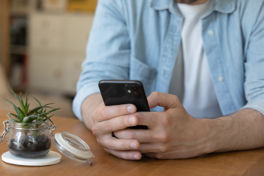
Do you own a smartphone? Do you use it to check your email? Do you own an ipad, kindle or other tablet? Do you use it to check your email?
If you said yes, to any of these questions, you are not alone! A new study by Yesmail, which analyzed over 6 billion emails sent during the 2013 holiday season, found that 55% of all email opens happened on a mobile device.
Couple that with the findings of an international study which found that 63% of Americans surveyed would either close or immediately delete an email that was not optimized for mobile viewing and you can quickly understand why mobile friendly email marketing templates are a MUST! Here are some mobile friendly email marketing template tips.
[Tweet “63% of Americans surveyed would either close or delete an email that was not optimized for mobile viewing – mobile friendly email marketing templates are a MUST”]
1. Use a mobile friendly template
This may sound ridiculously obvious but I still see many many email promotions and newsletters with multiple columns, sidebars and extra wide layouts. The easiest way to accommodate the various screen sizes and to be sure that your content will be easily viewed, is to use a mobile friendly template. Constant Contact, my email service provider of choice, now offers over one dozen mobile friendly templates. They are attractive, easy to use and most importantly, they EFFECTIVELY deliver your message no matter what device the recipient is using to view it!
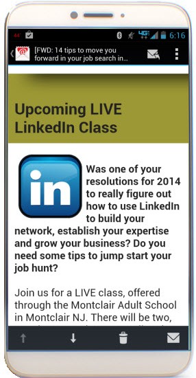
Single columns layouts still work best and will adjust to the width of the readers screen, as seen above in the screen shot of my enewsletter on a mobile phone.
2. Keep it brief
Mobile viewing, especially from a phone, does not lend itself to extensive reading. Keep the content brief and to the point.
3. Use easy to read fonts and font sizes
While you CAN be creative with your font choices, I would recommend sticking with the basic, easy to read fonts like Arial, Courier and Verdana. 12 point fonts are best for the body of your content going up to 22 or 24 for your headlines.
Black text on a white background or white text on a dark or black background also helps when people have their devices on a dimly lit setting to extend battery life and/or when they are reading outside.
4. Use ‘teaser text’ and links
An easy way to keep things brief is to use a short paragraph or ‘teaser’ text and include a link to the full post or article. Teaser text with a link actually serves three purposes:
- Keeps your mailing brief
- Let’s you track what is actually of interest to your readers (by checking the metrics on which links are most popular)
- Let’s you see WHO is interested in the topic associated with the link (click thru data will show you which recipients clicked which links)
5. Use the photo sizes recommended in the template
You CAN still upload images up to 800 px wide, to the mobile friendly templates but if they are larger than the sizes recommended in the template, they may not display properly and will require the recipient to scroll from side to side. This is not ideal. Sticking to recommended sizes will help ensure your readers actually SEE what you send, rather than just the far left portion of it!
6. Try it yourself!
Send a test email to yourself and look at it not only on your desktop or laptop but also on your phone and/or tablet. Ask a friend to view it on THEIR phone and/or tablet.This will be a much better test than just looking at the preview offered in the desktop and laptop versions of the tool and give you some idea of what needs to change to create a better experience for your recipient.
Every device display is slightly different but these tips should help you ensure that when your recipients open your email they WILL be able to see and action on the information you are sharing!
If YOU need help converting your existing template into a mobile friendly template, if you are interested in creating a fresh, new mobile friendly template for 2014 or if you want to learn more about email marketing and how it can help YOU grow your business, please give me a call at 212.664.1872 or email me at CC@LisaMarieDiasDesigns.com.
Email marketing WORKS – let us show you how to make it work for YOU!
For more email marketing tips and advice, please check out these posts:
- Checklist of items needed for a successful enewsletter
- 5 ways to use personalization in your e-newsletters and mailings
- 5 things to keep in mind when building your e-news mailing list